About TEE
TEE makes bath and body products for sensitive teen skin — gentle, effective, and fuss-free. Founded by mother-daughter duo Jo and Steph, their goal is simple: take the stress out of daily routines with science-backed, Aussie-made formulas that actually work.
")
Turning Everyday Packaging into an Unforgettable Unboxing
When you’re building a brand for teenagers, you can’t just look cool, you’ve got to feel exciting.
This teen-focused startup wanted their packaging to be exactly that — bold, sharp, and cute, full of personality, and something teens would actually want to show off. But as a small brand entering the market, custom packaging felt out of reach.
“If you’re obsessed with packaging and cute deliveries like me, you’re gonna love what we’re working on,” Steph, the founder, said in TEE’s Instagram reel. Her vision was clear: create an unboxing moment that feels joyful and special, without blowing the budget.
That’s where we stepped in, crafting a smart, flexible solution that mixed stock packaging and custom labels to build a distinctive, scalable look.
Making Packaging Part of the Experience
For most startups, packaging comes after the product. But for Steph, it was part of the product experience.
“We wanted the whole unboxing experience to be fun and exciting,” she shared with us. “Who doesn’t love that buzz when you’re opening up a package?”
From the start, the goal was clear: every bottle, tube, and box had to carry that spark of joy, from the first glance to the final unseal.

Step One: Bottles That Set the Tone
Square Shoulder Bottles with Personality
We began with the foundation — the bottles for their wash and body care range. The team wanted packaging that looked confident on the shelf but still felt soft and playful in hand.
We chose a square shoulder bottle with smooth, rounded edges — strong lines softened with curves. It gave the packaging structure without feeling harsh.
To enhance the sensory experience, we upgraded to a thicker, lock-down lotion pump. It wasn’t just about preventing leaks; it added weight and a satisfying press that gave the whole product a more premium feel. That tactile quality matters — especially for a teen audience that notices small details.
Large-capacity bottles made sense for daily wash and care products, combining practicality with a modern, minimal design. They didn’t just hold the product; they helped define the brand’s identity — clean, fun, and just a little grown-up.


Step Two: Tubes That Solve Problems and Steal Attention
Semi-Transparent Matte Tubes with a Twist
The next challenge was the body exfoliator. The original plan was to use jars, but there was one problem: it’s a sugar-based formula, which meant one dip with wet hands could turn it mushy over time.
So, we rethought the format.
We sourced a semi-transparent matte tube with a unique round tail design that fit perfectly with the brand’s soft, rounded aesthetic. The matte texture gave it a smooth, velvety look that photographed beautifully and felt modern.
To top it off, we added a flip-top cap that’s easy for one-hand use, leak-proof, and sturdy enough to handle thick formulas. Plus, it features a large opening for thicker content. These small details that makes the body exfoliator more enjoyable to use.
This tube wasn’t just practical, it became one of the most recognisable parts of the line. It captured the brand’s personality: cute, confident, and full of energy.

Step Three: Jars That Keep It Effortlessly Cool
Minimal, Semi-Transparent Jars That Let the Brand Shine
For other skincare products, we kept the same rounded edges design to maintain a cohesive visual story across the range.
But the design direction here was restraint. Only the logo and slogan appear on the jar — nothing else. No busy graphics, no overload of text. Just clean, airy space that lets the product speak for itself.
This simplicity wasn’t just aesthetic; it reflected the brand’s confidence. It said, “We don’t need to shout, we know who we are.”
The jars felt simple yet refined, aligning seamlessly with the brand’s vision for a fresh, teen-friendly identity.

Step Four: Boxes That Do the Talking
Outer Boxes with Purpose
With such minimalist jars, we needed somewhere to house the required information — barcodes, ingredients, instructions. So, we introduced outer boxes as a clean information carrier.
This product box not only protected the products but also completed the unboxing ritual the founder cared so much about.
That satisfying touch, the adorable shape, and the pop of colour from the labels turned every unboxing into a moment worth filming or sharing — exactly what you want for a teen audience that loves to post their finds online.

Why It Worked
This packaging system gave the brand space to grow — visually, creatively, and operationally.
- High Flexibility: One bottle design could serve multiple products, and a label swap made it brand-new.
- Creative Freedom: Custom labels became the design playground, letting the team play with bold, cute graphics.
- Low Investment: Using stock packaging avoided high mould fees.
- MOQ Friendly: Perfect for small batches and trial launches.
- Fast Iteration: Easy to refresh if a formula or look needed tweaking.
It’s proof that with the right approach, startup packaging can be strategic and expressive — not just functional.
Getting the Details Right
When the first label samples arrived, the artwork didn’t quite fit, it was slightly too short, leaving part of the tube exposed. A small issue, but visually distracting.
We adjusted the dieline and artwork for full 360° label coverage, giving each tube a smooth, uninterrupted finish. That tweak elevated the whole presentation, proof that good packaging design is about details that most people don’t notice, but everyone feels.
From Excitement to Experience
At launch, the founder shared what many of us could relate to:
“I get so excited when I open a package — even when I already know what’s inside. But when the unboxing experience is more than just a plain cardboard box? That’s next-level.”
That moment of excitement, the one she described, became the soul of the brand. Every label, every bottle, every box was designed to make customers feel that same joy.
From Ordinary to Obsessed
This project shows how creativity doesn’t always come from big budgets. By combining stock packaging with smart design, this teen startup built a playful, polished identity that connects instantly with its audience.
Because great packaging isn’t just what you see — it’s how it makes you feel when you open it.


About Primepac
PrimePac is a custom packaging provider in Australia. We believe in a collaborative approach, working closely with our clients to create innovative and sustainable packaging that stands out, drives sales, and aligns with brand identity. We work with great companies of all sizes and we’ve helped more than 1,100 businesses that seek to differentiate their products in a competitive market.
We Can help you with


Explore Similar Products
Uncover More Inspiring Case Studies
Packaging for Candle
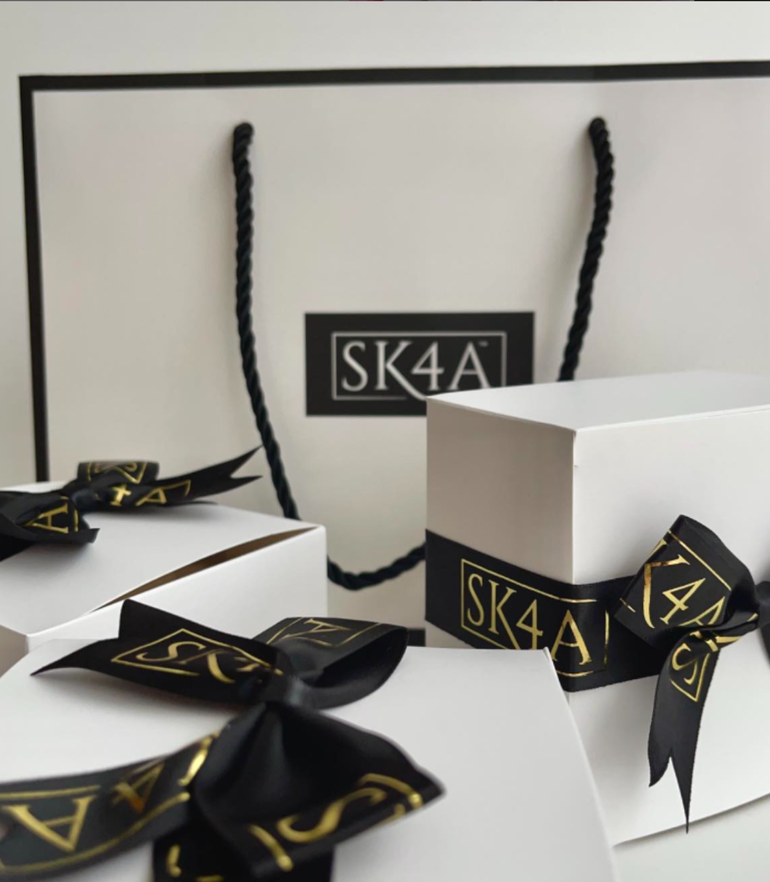
SK4A
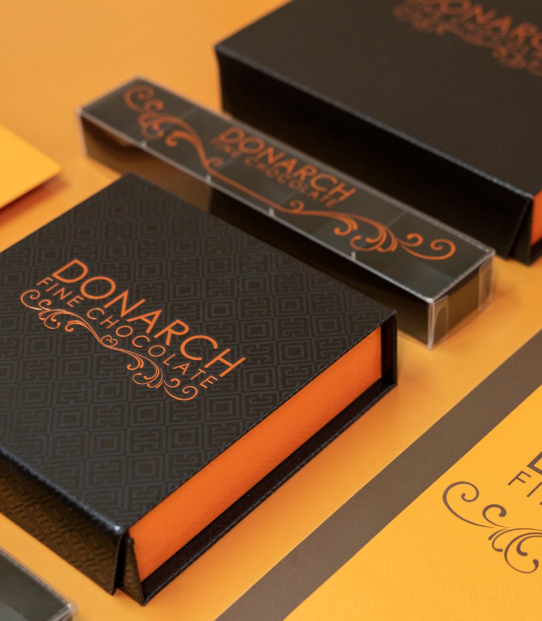
Packaging for Chocolate
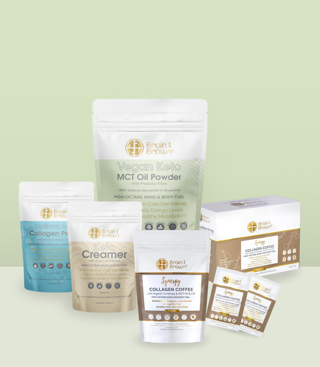
DONARCH FINE CHOCOLATEPackaging for Coffee & Tea
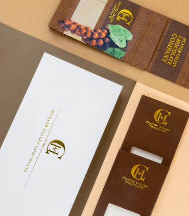
Brain & BrawnPackaging for Food
Hunter Valley ChocolatePackaging for Fragrance
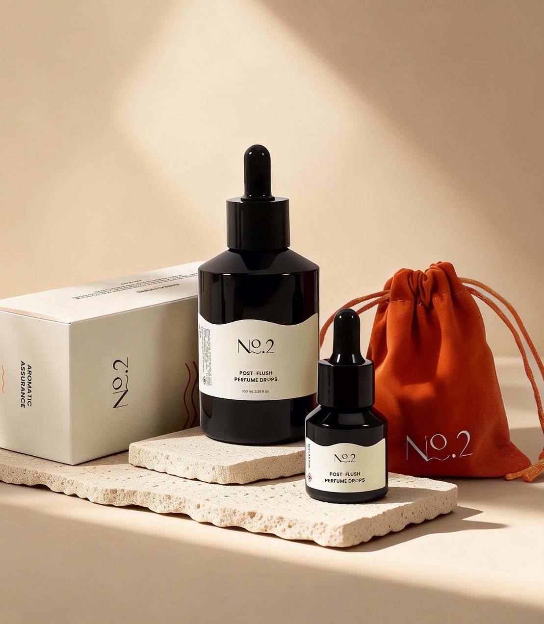
No.2Packaging for Health & Wellness
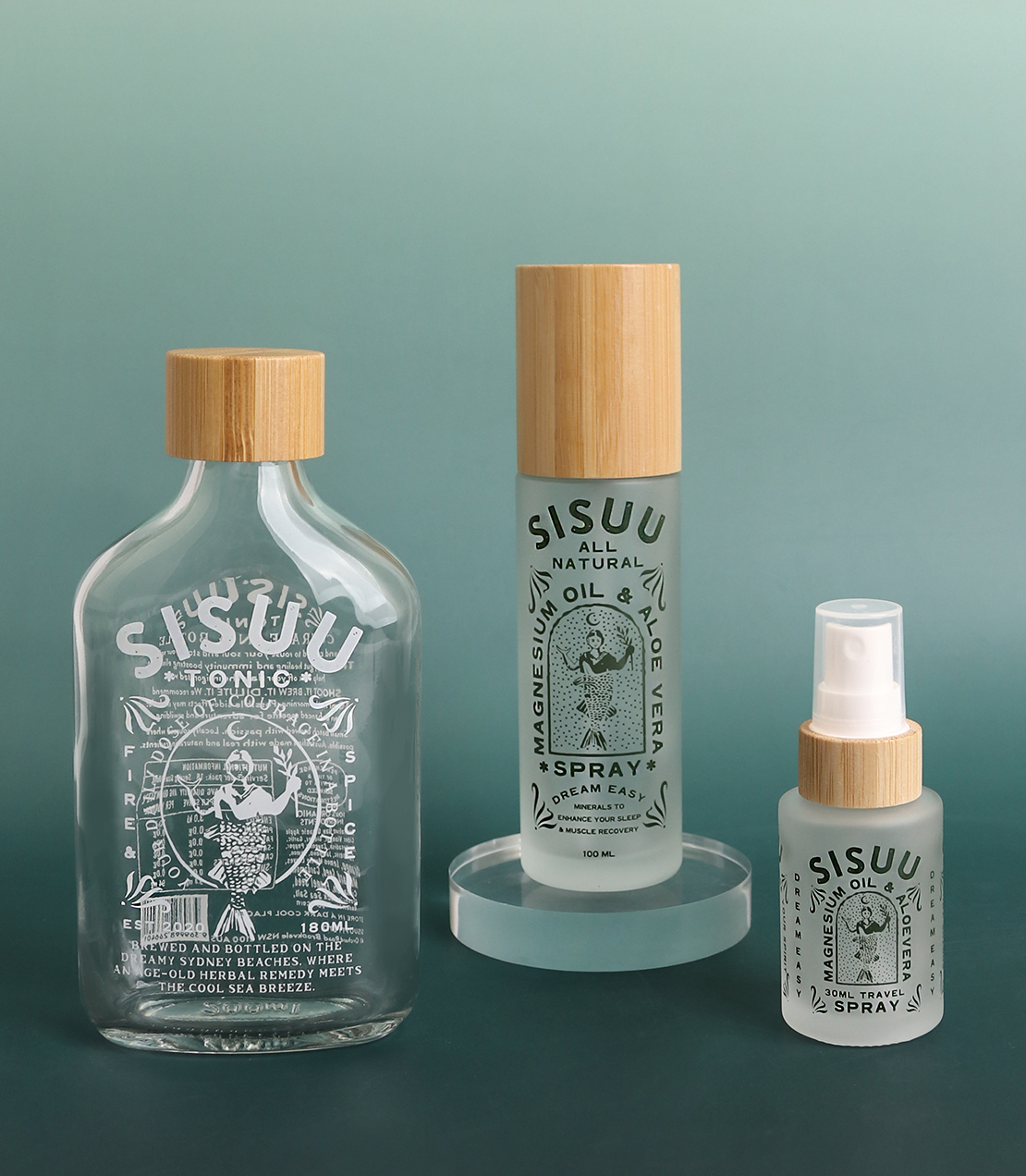
SISUUPackaging for Personal Care
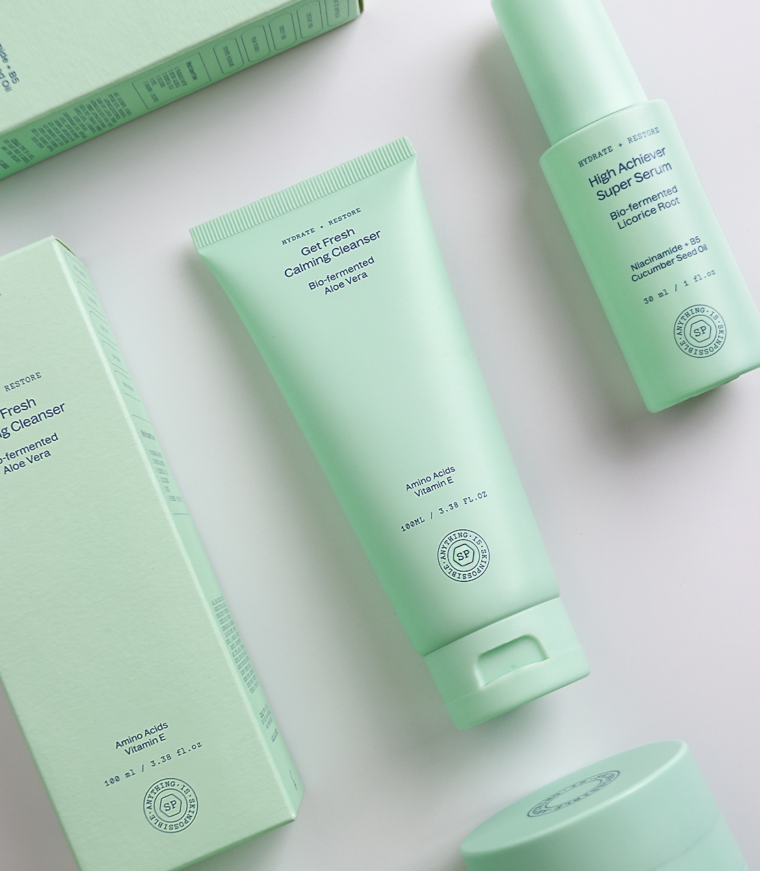
ANYTHING IS SKINPOSSIBLEPackaging for Pet
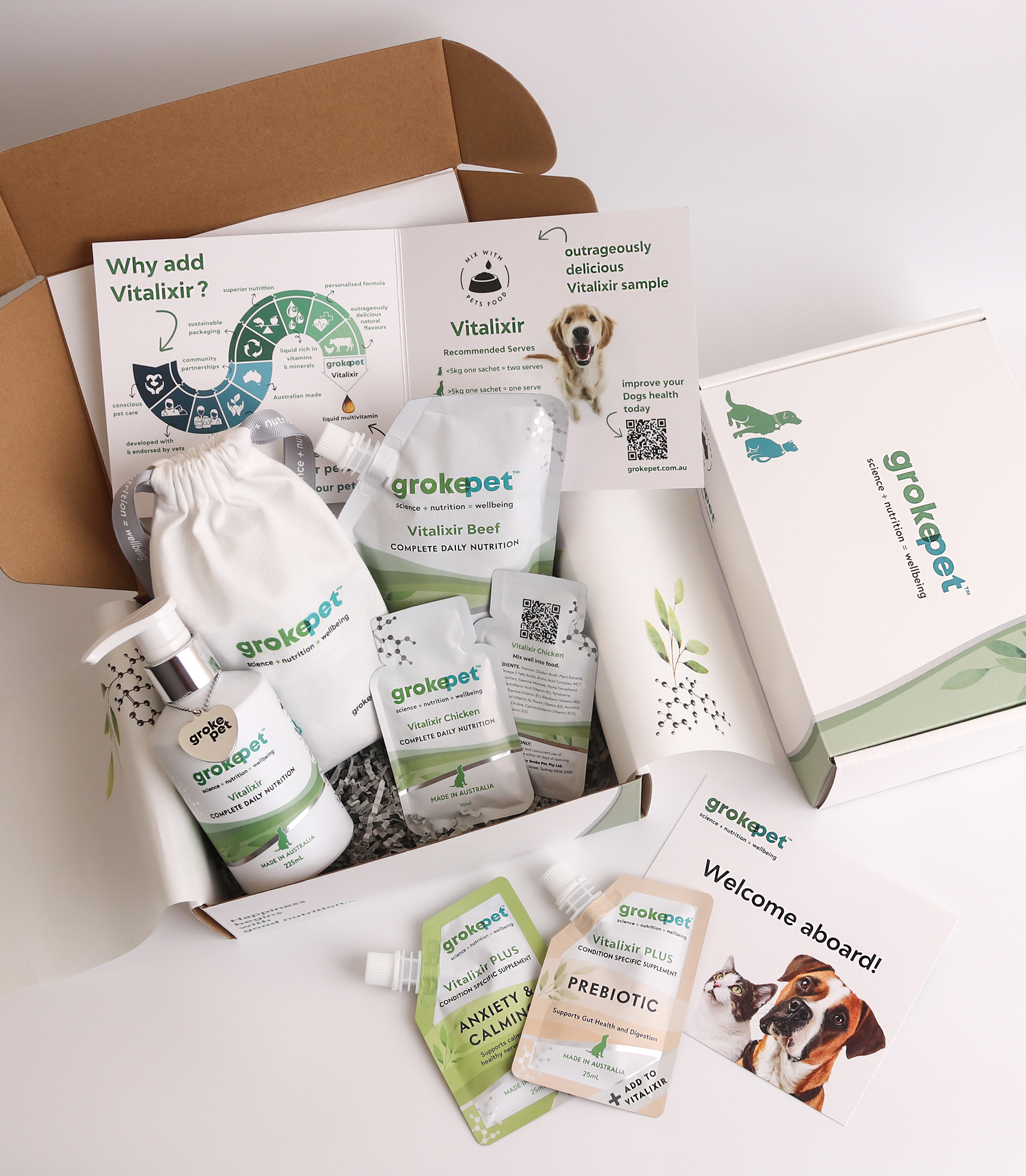
grokepetPackaging for Skincare
AMBRE VERNAY