About Ambre Vernay
Ambre Vernay is all about premium anti-aging skincare. Founded by Manon Vernay, it mixes French elegance with Aussie botanicals to deliver products that work hard against the harsh Aussie climate.

But here’s the thing: the anti-aging skincare market in Australia is packed. So, how does a luxury brand stand out? By creating a visual identity that screams sophistication. Ambre Vernay needed packaging that was as luxurious as the products inside—and that’s where we came in.
What We Did: Primepac’s Packaging Magic
We don’t do ‘one-size-fits-all’. Ambre Vernay needed packaging that told a story. Here’s what we put together for them:
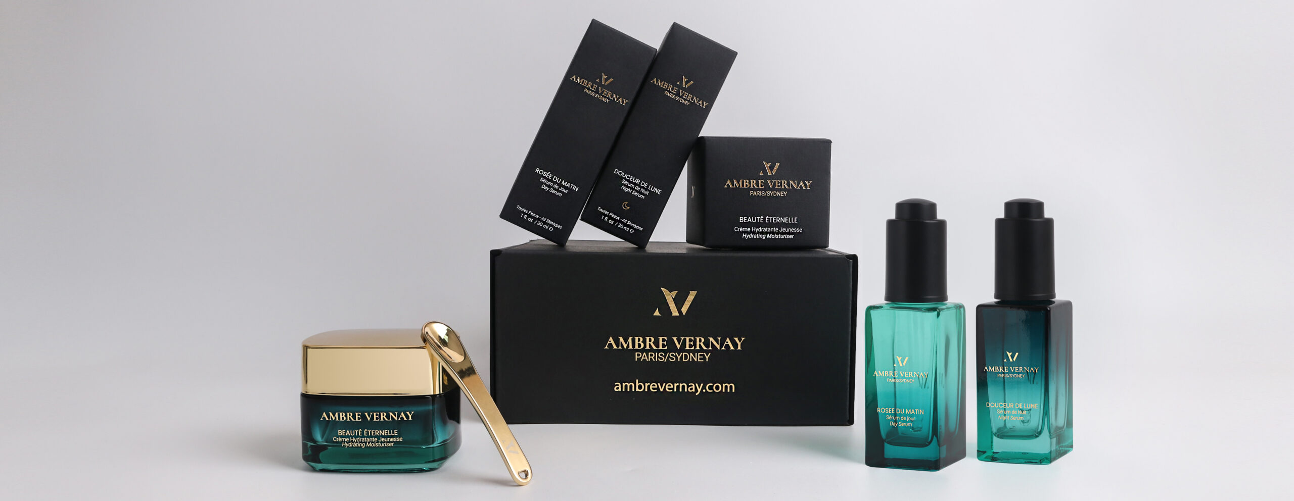
Primepac delivers tailored solutions from material selection and custom construction to production management and logistics. The final packaging includes:
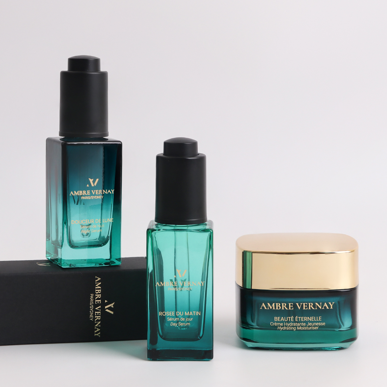
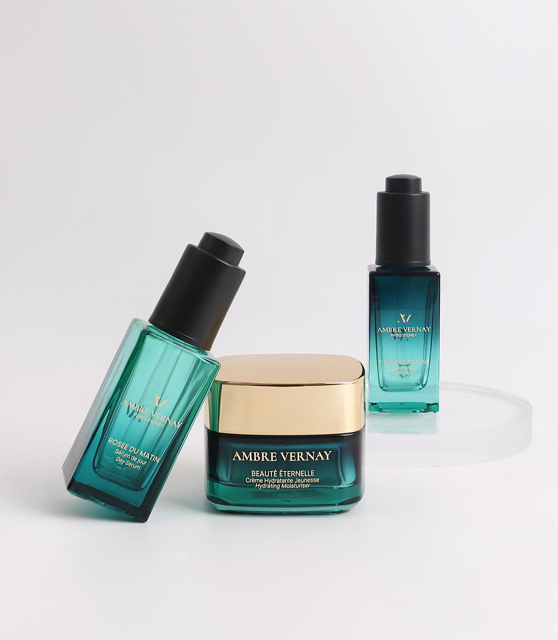
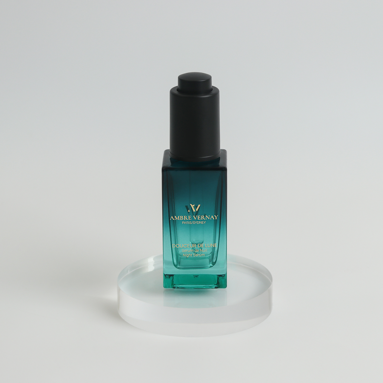
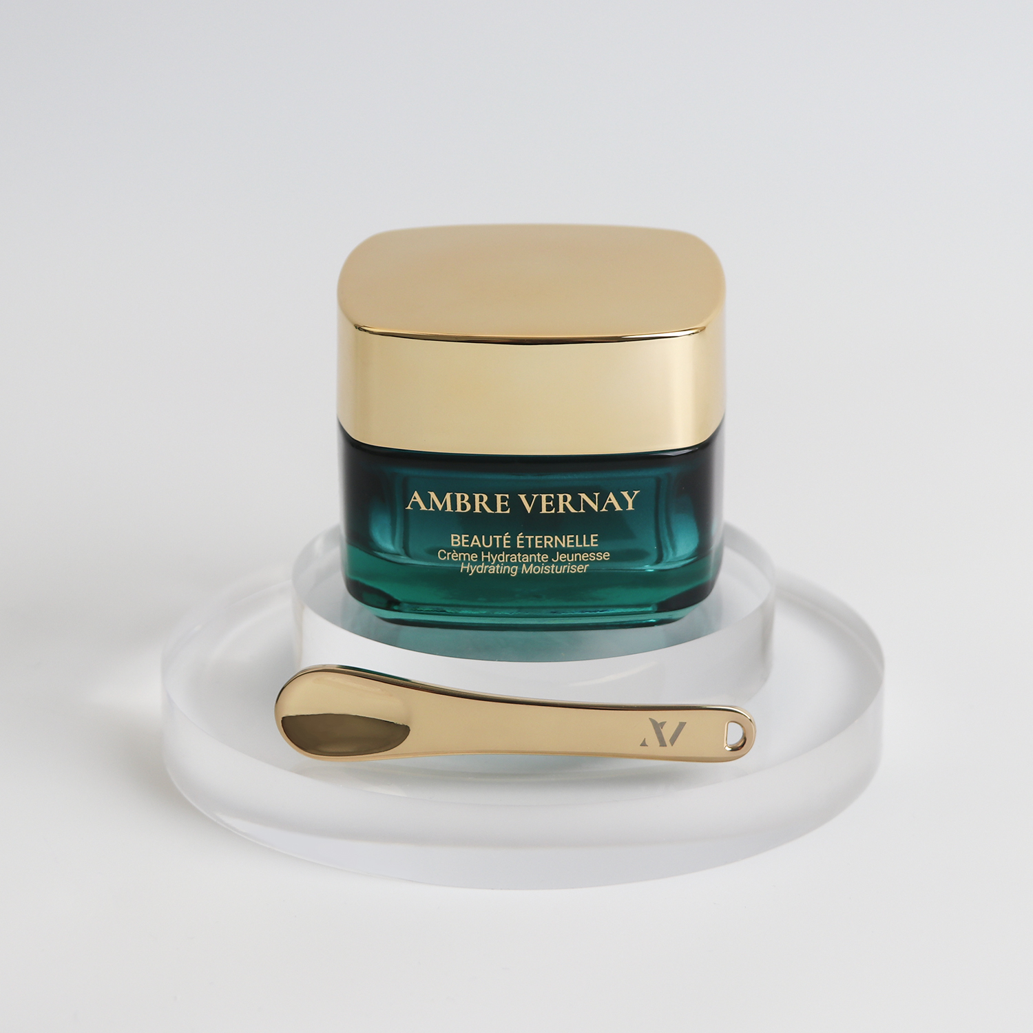
- Gold Foil Logos & Accents: Subtle, yet eye-catching. These touches pop and let customers know they’re dealing with something premium.
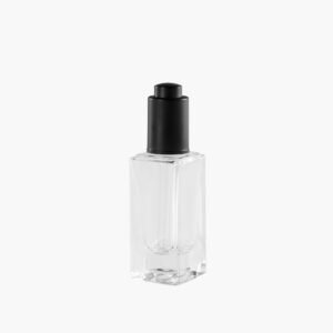
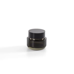
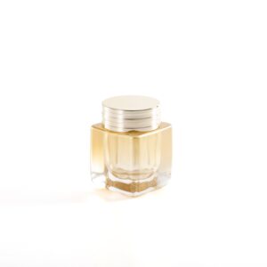
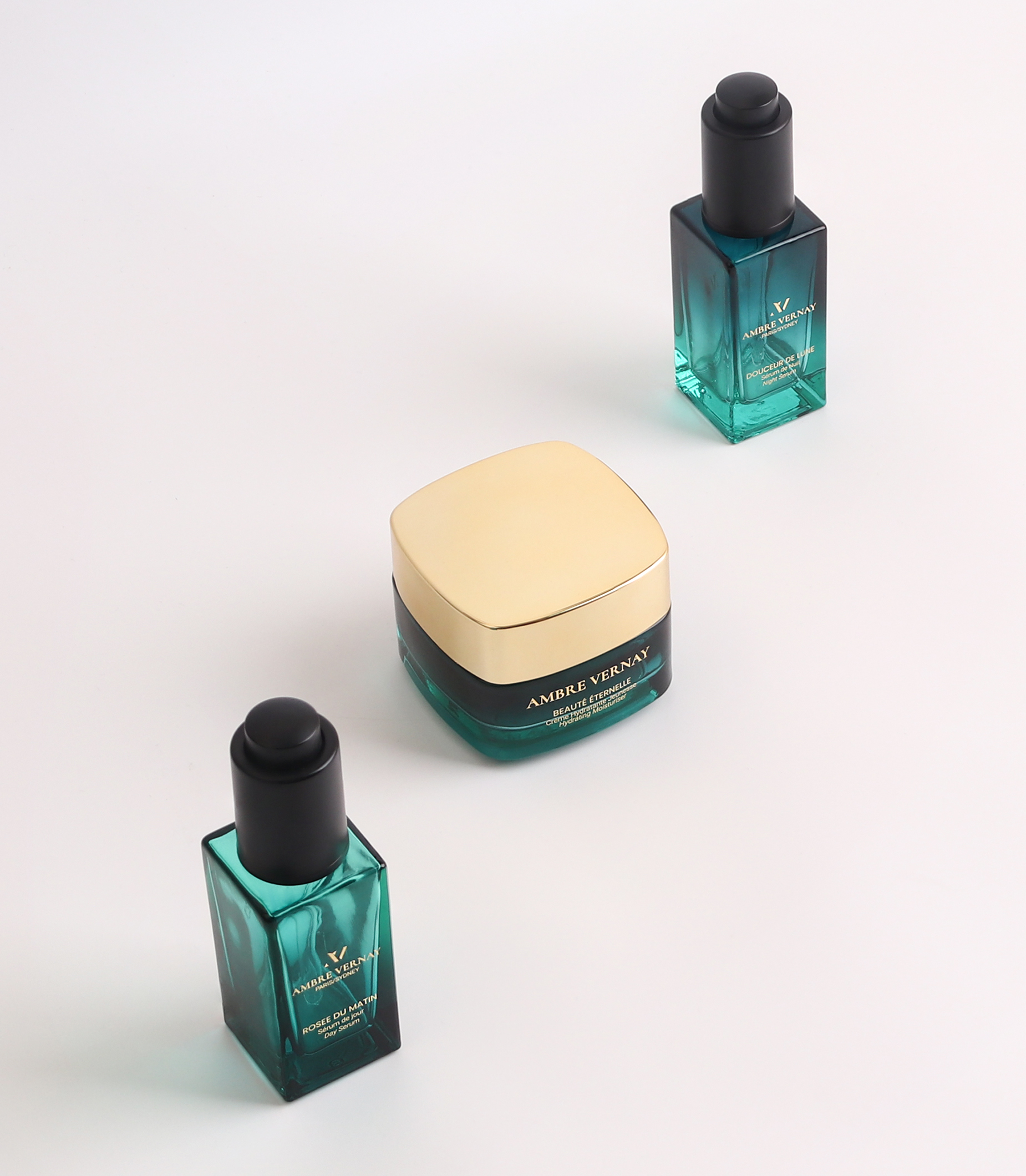
- Gradient Colour Square Glass Droppers & Glass Jars: Each bottle and jar is designed with a gradient colour that catches the light just right. It’s a luxury packaging solution that stands out.
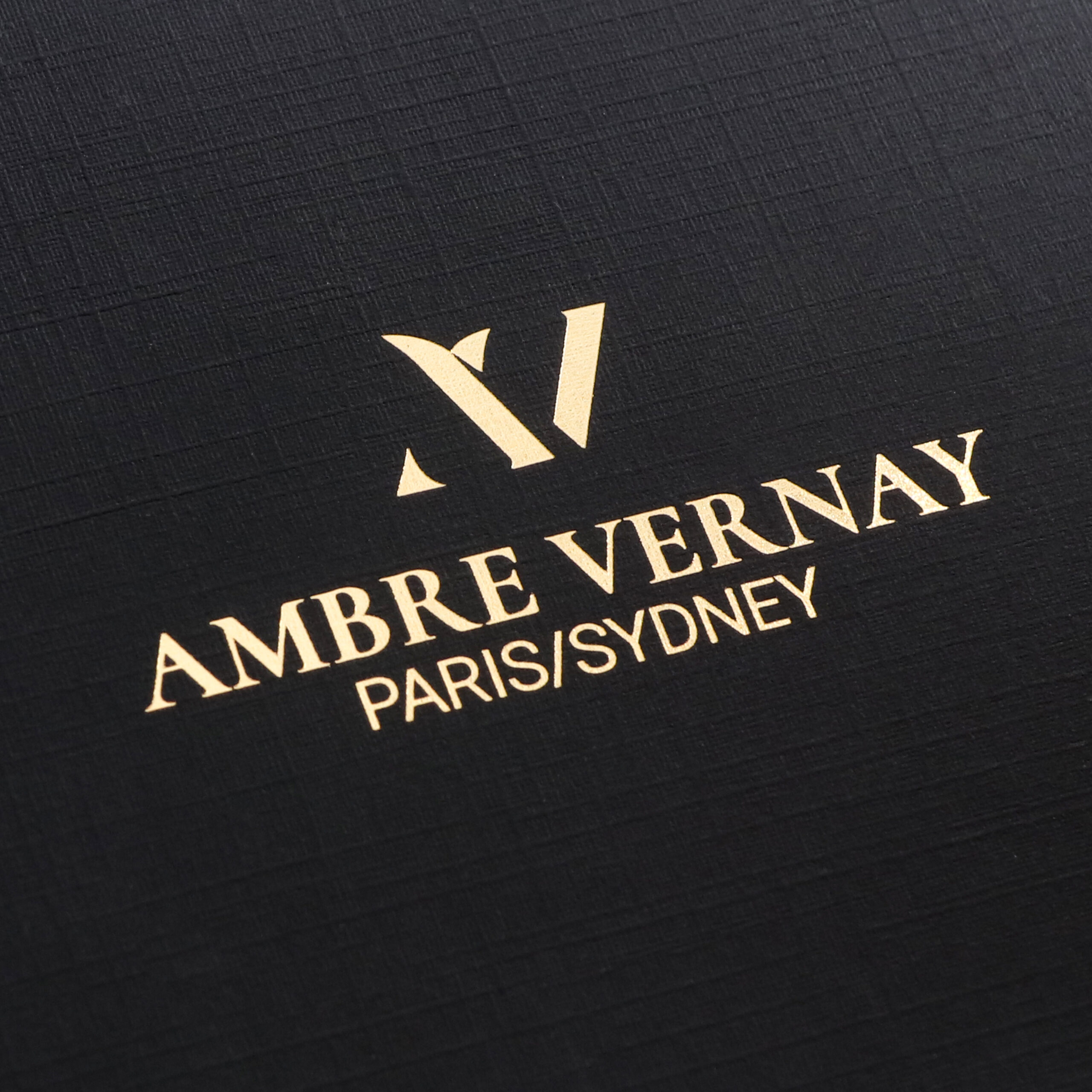
- Black Boxes with Linen Paper Texture: We went for black boxes with a fabric pattern to bring out that tactile luxury. The texture isn’t just for looks—it gives that ‘wow’ factor when someone holds it.
- Laser-Engraved Gold Spoon: A little extra, but it totally sets the tone for the brand. When customers get their hands on the spoon, it feels exclusive.
Challenges We Tackled Together
Here’s the thing: designing premium packaging isn’t all smooth sailing. We ran into a few hurdles, but no big deal—we solved them, and here’s how:
1. Colour Matching for Gold Foil
Hot foil printing is great for rich metallic colours, from metallic gold and silver to vibrant reds and purples—essentially any shade you can imagine, but it’s tricky to get the gold effect just right across different materials (like glass and cardboard). We used a colour-matching system to make sure that gold foil stayed consistent across all surfaces—no awkward patches or mismatches.
2. Font Visibility on Textured Paper
Black textured paper sounds cool, but white fonts can get lost in the mix. So, we swapped out traditional offset printing for silk screening. This thicker ink gave the fonts a bolder, cleaner look.
The End Result?
Ambre Vernay now has luxury skincare packaging that’s as high-end as their products. It reflects their brand’s commitment to quality and sustainability. More importantly, it sets them apart from the competition in the crowded anti-aging skincare market.
Primepac: Your Go-To for Custom Packaging
PrimePac is a custom packaging provider in Australia. We’re not just about slapping a logo on a box. We’re all about creating packaging solutions that help your brand stand out, drive sales, and align with your identity. At Primepac, we work closely with brands to deliver custom packaging that makes a real difference. Want to stand out? Let’s talk.
We Can help you with

Explore Similar Products
Uncover More Inspiring Case Studies
Packaging for Candle
SK4APackaging for Chocolate
DONARCH FINE CHOCOLATEPackaging for Coffee & Tea
Brain & BrawnPackaging for Food
Hunter Valley ChocolatePackaging for Health & Wellness
SISUUPackaging for Personal Care
ANYTHING IS SKINPOSSIBLEPackaging for Pet
grokepetPackaging for Skincare
AMBRE VERNAY
